Al Helal Hadi
Menu
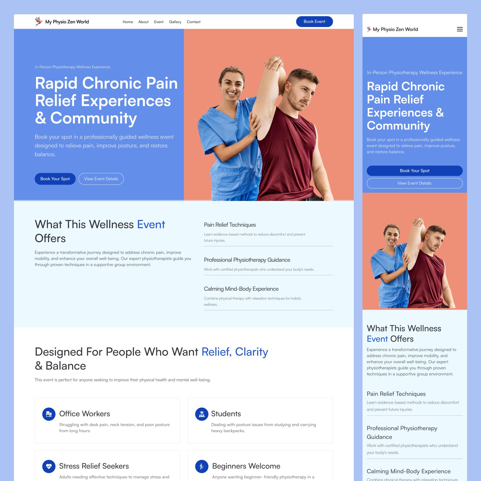
Designing a Holistic Digital Experience for a Physical Therapy and Mind-Body Wellness Platform
A calm, trust-first website experience for a global physiotherapy and wellness brand—designed to explain a mind-body approach clearly and encourage bookings, learning, and ongoing engagement.
Client
My Physio-Zen World
Service
Website UI/UX Design (Responsive)
Industry
Healthcare & Wellness
0.1
Context & Objectives
Create clarity and credibility for a blended physio + wellness offer.
My Physio-Zen World combines physical therapy with mind-body practices, which can be powerful—but hard to explain quickly online. The goal was to present the approach in a grounded, professional way that feels accessible to a worldwide audience and works smoothly across desktop and mobile.
The design aimed to position the brand as both caring and clinically trustworthy, while supporting key actions like exploring Soul School, reading the Soul Blog, and reaching out through Contact.

0.2
Problem Statement
Visitors needed a simpler path to understand “what this is” and “who it’s for.”
When a service sits between healthcare and wellness, users can hesitate if the language and structure feel vague or too spiritual—or too clinical. The challenge was to reduce confusion and build confidence without overwhelming people with long explanations.
The site also needed stronger hierarchy and content flow so new visitors could navigate from first impression → learning resources → contact, without getting lost or dropping off.

0.3
Information Architecture
A minimal sitemap designed around learning, trust-building, and inquiry.
The IA was intentionally small to keep decision-making easy: Home introduces the method and outcomes, Soul School supports structured learning, Soul Blog builds ongoing trust through content, and Contact Us stays visible as the primary conversion point.
Sitemap: Home, Soul School, Soul Blog, Contact Us—organized to guide users from understanding the approach to taking the next step
0.4
Solution Strategy
Design a calm UI system with strong UX hierarchy and accessible content layouts.
I planned responsive screens with clean typography, generous spacing, and clear sectioning to make complex topics feel digestible. The UX focused on guiding users through key messages—what the practice offers, how it works, and how to engage—supported by consistent CTAs and easy-to-scan modules for programs and articles.
The result is a modern, wellness-forward interface that still feels professional enough for a healthcare context, helping users feel safe, informed, and ready to contact.